Keepers Harvest
Brand Identity, Packaging Design, Environmental Design
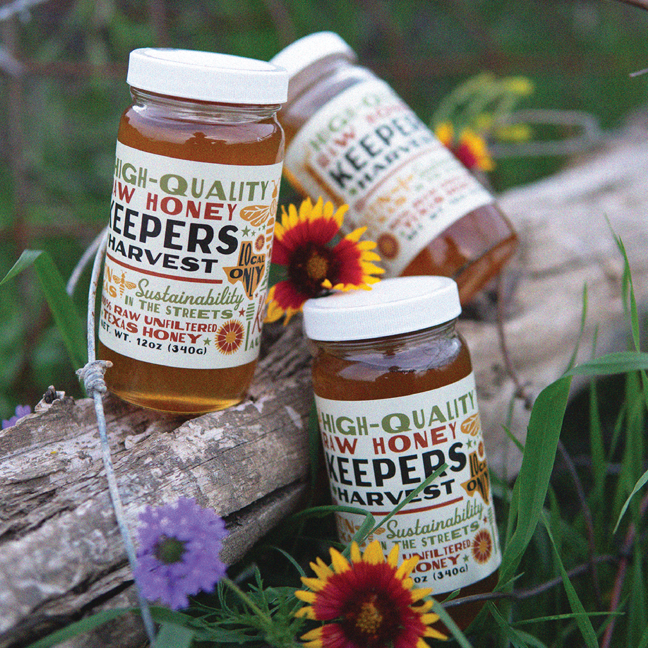
Beyond the hive, Keeper Harvest is revolutionizing the honey industry by transcending conventional boundaries, offering distinct and vibrant products that perfectly capture the essence and energy of our brand.
Their mission is to go beyond the ordinary, offering honey & beekeeping services that encapsulate the richness of life, joy and a genuine connection to the land.


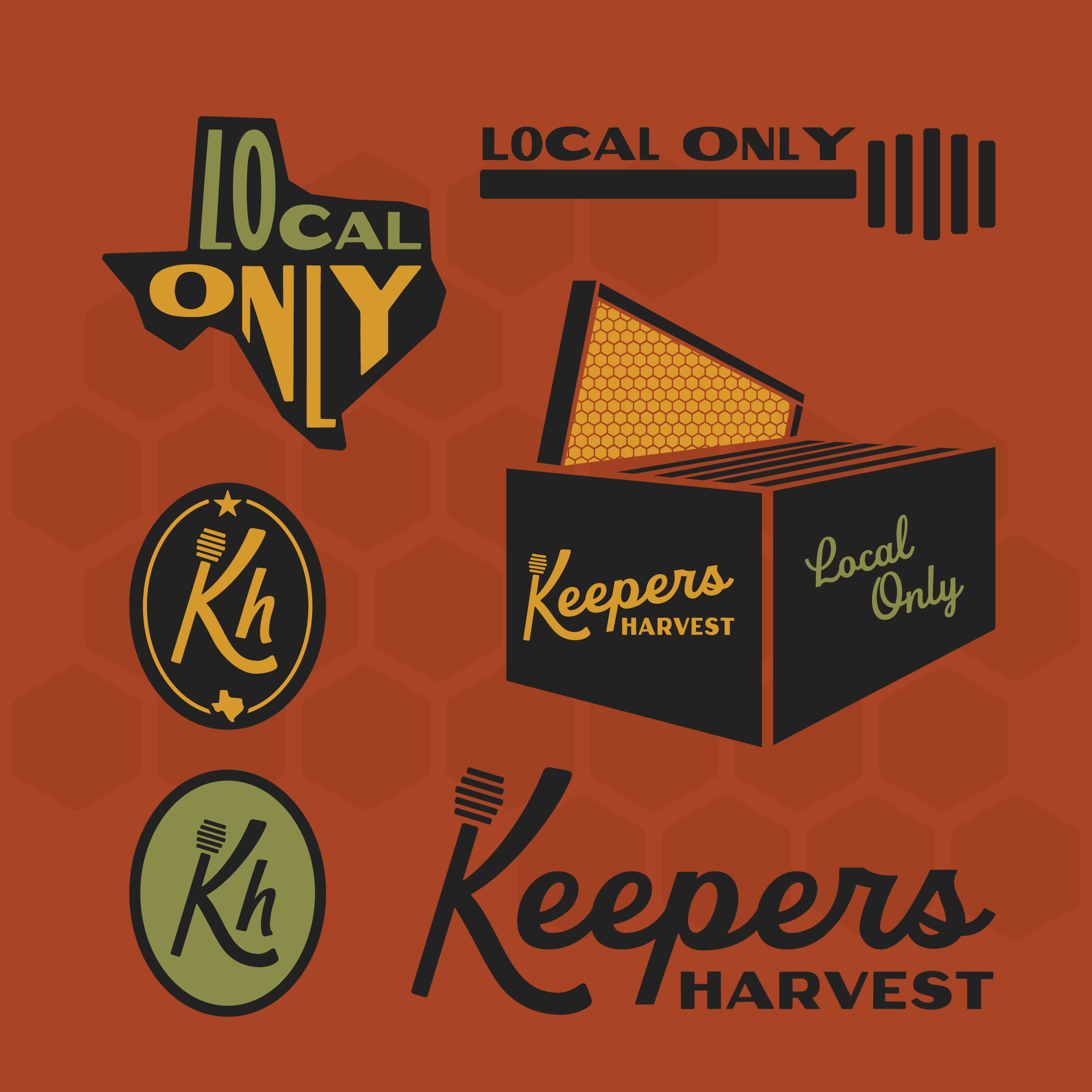
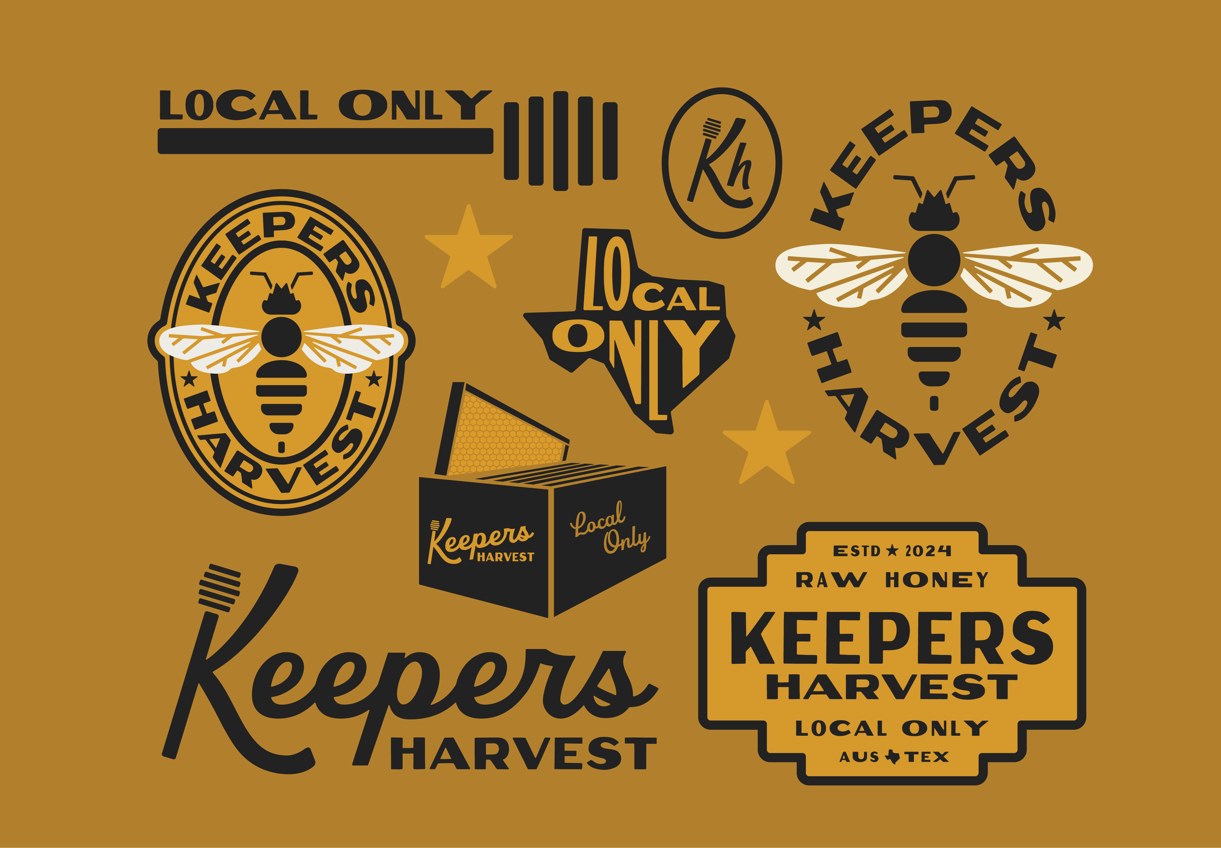
From custom scriptmarks to brand marks, this project had it all. This color palette breaks away from traditional honey branding, aligning perfectly with the mission of promoting sustainability.
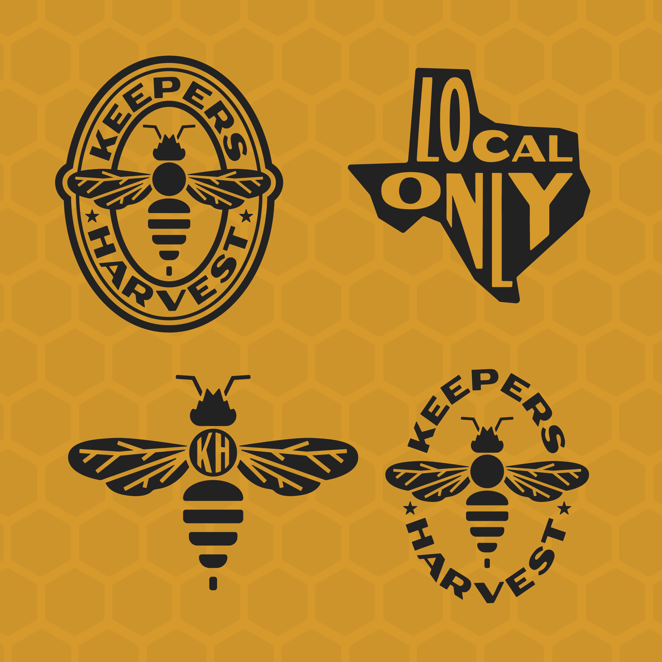
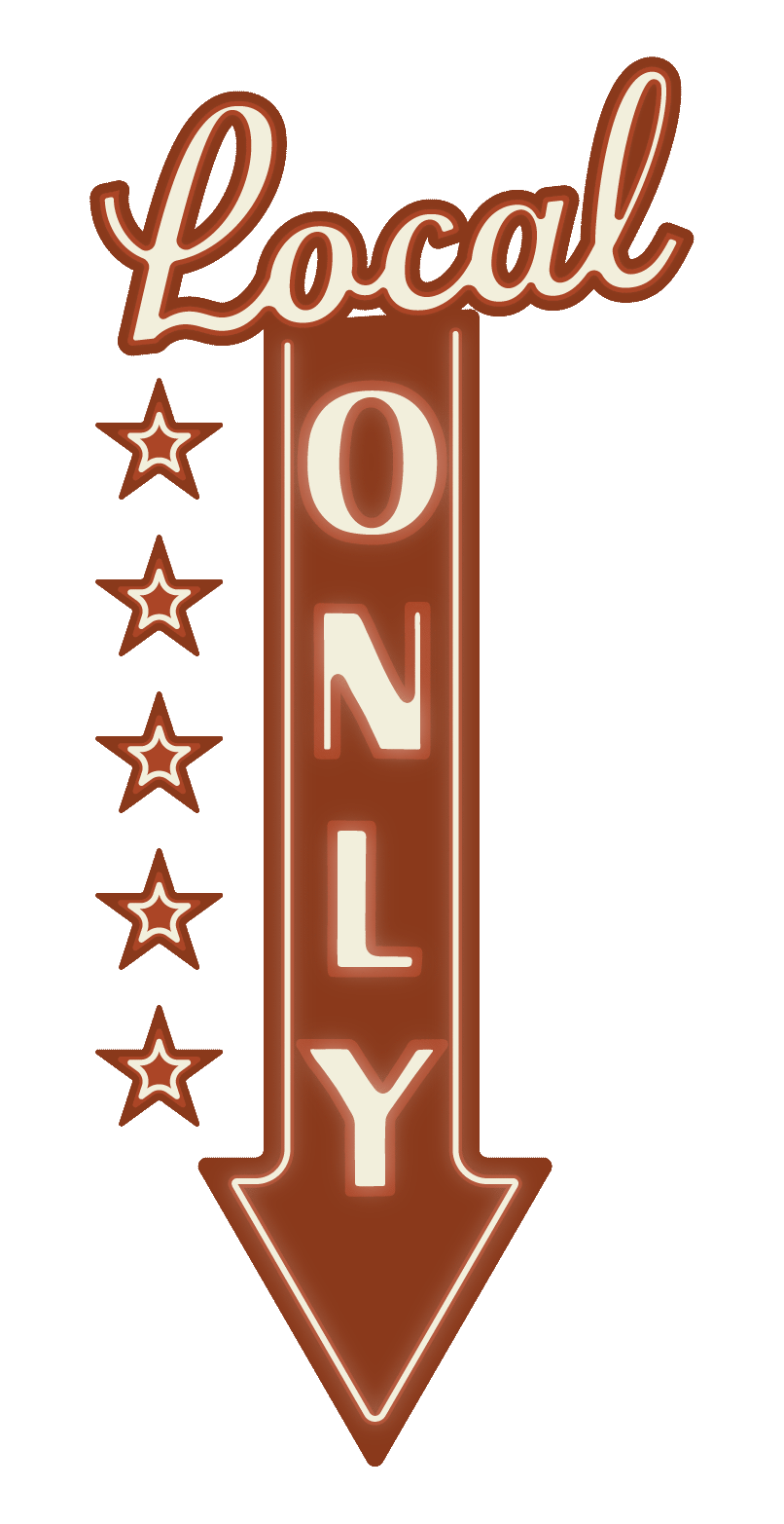
The bee logo, inspired by Austin’s skyline, symbolizes Keepers’ commitment to local values and a community-centric approach.